Practice Makes Perfect

My friend, Tra needs a new headshot for her website, so I agreed to meet her and have a little portrait session.  When I got there, she told me she had changed her mind and just wanted to talk- so that’s what we did.  But, while we were talking I took a few practice photos.  This one is my favorite- I think it gives you a glimpse of her beautiful spirit shining through her eyes.

12Feb2013-7482

Tra likes it too- so now we’re going to do another one- for REAL this time!  I’ll keep you posted!
Beyond Beyond 5

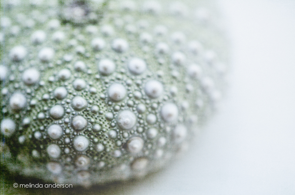
This week’s Beyond Beyond (2B) challenge was to find the best light in your house- and to practice some Photoshop tricks to add more light to photos. I am pretty familiar with the light (and lack of light) in my house at different times of the day after having done a Project 365 for two years, so concentrated on the Photoshop techniques.  I used the Sybil texture, as well as a white gradient to enhance the window light that was already present in this macro of a sea urchin from my shell collection.

23Feb2013-7961-Edit-2

And here’s a black and white version of the same photo (almost the same processing).

23Feb2013-7961-Edit

Hanging On

It amazes/amuses me to see bare trees with just a leaf or two just hanging on throughout autumn and winter when the rest have all fallen and been swept or blown away.  There’s a lesson there somewhere. . .

20Feb2013-7896-Edit

Textured with Anna from Kim Klassen’s Downton Abbey collection.

More Blossoms

15Feb2013-7702-Edit

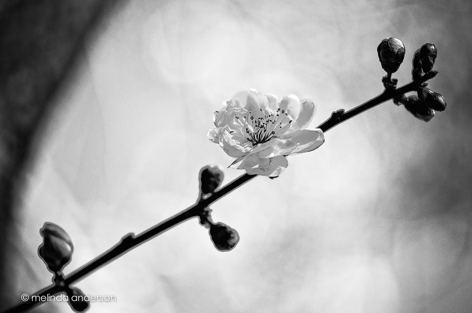
The above is another view of a plum blossom- converted to black and white.

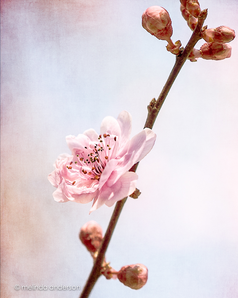
And below is a macro of a blossom on the verge of blooming!  I textured this one with two layers of Daisy and just a touch of Anna, whom I added because I like her so much better than Daisy 🙂 ( from the Downton Collection by Kim Klassen)!

15Feb2013-7738-Edit-Edit

Blooming

15Feb2013-7706-Edit-2-Edit

Last Friday, I photographed this blossom- one of the few on my flowering plum that day.  Today the tree is covered with blossoms.

I used 3 layers of texture in my edit- more than usual for me- because I was attempting to tone down the pinks (the blossoms) and the blues (the sky) in the background.  Much as I appreciate the springtime colors in my otherwise drab garden, the effect in the photo was giving me flashbacks of the wallpaper in my childhood bedroom.  I loved it when it was put up, but as I grew older I found the pink and blue flowers babyish and frilly and girly.  Daisy and Sybil from Kim Klassen’s Downton textures muted the background, while Cora kept the blossom pink. 🙂

I’m still reeling after Sunday’s Downton Abbey finale!  I knew something major was going to happen- and I’m still getting over the earlier tragedy (not specifying in case you aren’t caught up). Too much action for one season= but I do think this opens up lots of plot possibilities!

Follow the link at the bottom of the page to see more photos using textures from Kim’s Downton collection. Happy Texture Tuesday!

P.S. I removed the footprints from yesterday’s beach photo- the incompleteness of them bugged me.  Next task: add MORE footprints to the black and white version- MAYBE!  Check out yesterday’s post for the update.

Summer in Winter

Ahhhhhh . . . sunshine and sand and ocean waves!  We spent a lovely hour and a half at Salmon Creek Beach on Saturday- just watching the waves, the gulls, and the people.  I don’t know the official temp, but I’m guessing seventy something- shirtsleeve weather.

We got there early, set up a blanket, and just enjoyed the scene.  I had a camera battery with a distressingly low charge  (yes, I had charged it- no, I didn’t see that it was actually not charged when I put it in the camera- no, I won’t be using that tricky outlet again), but had decided that I would just take whatever photos I could and would shoot “intentionally”- one of my 2013 goals.  No snapping away.  And definitely no seagulls- I can photograph them any day of the week in my own town.

Of course, I couldn’t resist the seagulls- they were everywhere. But this photo is the one I like the best- the light, the clouds and the expanse of beach.  I’m not convinced the footprints add to the photo- but they were there, kind of leading to nowhere.  I am using the photo in response to a Flickr challenge about using leading lines to guide the viewer into the image.  But the lines I was seeing when I composed the photo were the stripes of clouds and the surf.

16Feb2013-7798

I think this photo also works as a black and white.  What do you think?

16Feb2013-7798-2

UPDATE:

I took out the footprints! What do you think?

16Feb2013-7798-Edit

Country Drive

I thought I’d share a couple more photos from our drive last Saturday.  After our walk in downtown Suisun, we drove some of the backroads between Fairfield and Vacaville.  These two shots were actually taken right across the road from each other in the fading light, as the sun had already dipped down behind the hills.  There is a haze in the first image from smoke we could see in the distance.  I reduced clarity to blur the image a bit, enhancing the hazy quality.

9Feb2013-7450-Edit-2

I liked the shapes of the bare branches and fence on the hill across the road silhouetted against the cloudless sky.  I converted it to a black and white in Lightroom and then added back some color on the tree and hill using a texture.

9Feb2013-7447-Edit-2-Edit

Beyond Beyond 4

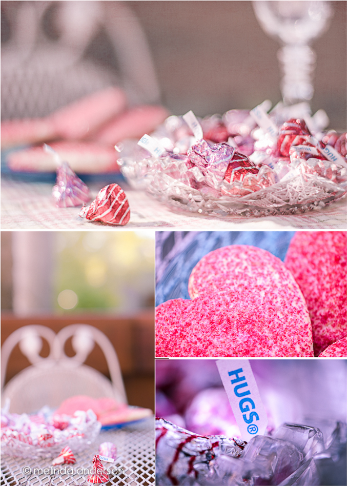
The task this week was to bring something outside- from inside.  I was already planning to do something with Hershey’s Hugs (kisses were sold out. . .)- so I dragged them outside and created this layout.  Happy Valentines Day!

valentine layout

I did learn something new from this week’s lesson (talk amongst yourselves if you don’t use Photoshop. . .)- the best way for ME to add a texture to a photo is using MiniBridge.  Since I started using Aperture (and later Lightroom) before I started using Photoshop, I never found a need to open photos using Bridge or MiniBridge.  Now I see that, when I add a texture to a photo, it is much easier to keep MiniBridge open and drag a texture onto the photo, rather than clicking Open and using the finder window.  So- as my grandson, Henry would say- Happy, Happy, Happy !

Downtown Lighthouse

Last Saturday I was itching to get out and shoot some photos.  It had been a fairly stressful week, as weeks go, and, I felt a drive and some new scenery would be good for both of us. I thought of the little town of Suisun, which, although it is nearby, we hardly ever visit.  I looked online and noticed there was a lighthouse.  Lighthouse? In downtown Suisun? We drove over and and discovered the Suisun Harbor Lighthouse. Built in 2006, it is just 52 feet high- and does not guide ships.  It instead is a beacon leading people to the harbor area of the newly revitalized downtown.

I was drawn to the stripes.  This shot, converted to black and white, is my favorite.

9Feb2013-7401-Edit

LOVE

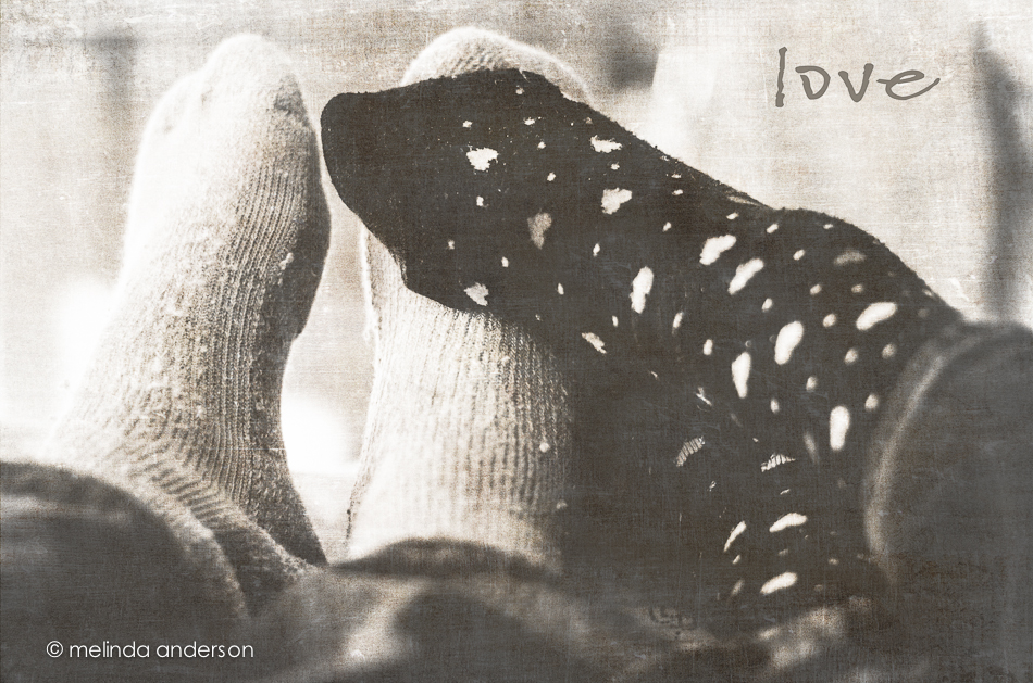
After 41 years- it must be love!

Today’s theme for Texture Tuesday is love.  I conceived this photo originally in response to a Clickin Moms’ creativity challenge, Body Language, and thought it would be perfect for Love as well.  And I got another excuse to wear my favorite valentine socks from my teaching days! 🙂

8Feb2013-7335-Edit-Edit

I played with this one a bit, converting it to black and white-and then adding a layer of Mary, one of Kim Klassen’s textures from her new Downton collection.  Since Downton Abbey is my most favorite TV show, I love having these new textures named after the the Crawley women.  I wanted to use Sybil, but the tones of Lady Mary’s texture worked better with the image I had in mind.  Next time, Sybil!

To see some beautiful textured images centered around a LOVE theme- head on over to Kim Klassen’s site.

Bubble Macros

Take one glass of water, add some drops of olive oil, set the glass on something colorful, set up your macro lens on a tripod- and VOILA!  Instant fun!

To my teacher friends who are still working: yes, retirement is A W E S O M E !

6Feb2013-7156

Black and white versions are fun too.

6Feb2013-7184


Beyond Beyond 3


For this week’s Beyond Beyond assignment, we were challenged to take a series of photos with a shallow depth of field, focusing on different parts of the scene.  We were then to choose our favorites to post.  I chose my gerbera daisies, which are fading fast, for this assignment. Invariably, my favorites had the pink flower in front in focus, although I took quite a few focusing on the rear flowers or teapot.  So here are the three I like best.

teapot and flowers layout

I took these three shots using the light from my bedroom window.  If you look closely at the bottom photo, you can see a reflection of me sitting on the bed!

Macros in Pink

I experimented with my macro lens last weekend- shooting gerbera daisies and water drops.

For the top photo I used a long exposure and small aperture to increase depth of field- and mostly succeeded.

3Feb2013-7109

For the shot below, I used close to the maximum aperture of my macro lens (f/4) and went for a very shallow depth of field.  I further reduced the clarity in Lightroom to accentuate the dreamy look.

2Feb2013-7028