We need rain, but this sunny weather is fantastic! Here’ a shot of some daisies starting to bloom in the front yard, textured with Kim Klassen’s sybil texture (again!).
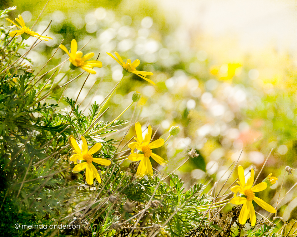

We need rain, but this sunny weather is fantastic! Here’ a shot of some daisies starting to bloom in the front yard, textured with Kim Klassen’s sybil texture (again!).
You may say I’m a dreamer, but I’m not the only one. – John Lennon

Texture Tuesday- dream edition!
I used textures from Kim Klassen’s Downton collection- two layers of isabel, two layers of sybil.
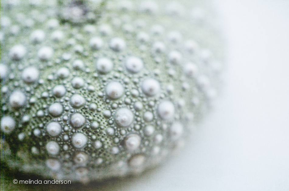
This week’s Beyond Beyond (2B) challenge was to find the best light in your house- and to practice some Photoshop tricks to add more light to photos. I am pretty familiar with the light (and lack of light) in my house at different times of the day after having done a Project 365 for two years, so concentrated on the Photoshop techniques. I used the Sybil texture, as well as a white gradient to enhance the window light that was already present in this macro of a sea urchin from my shell collection.
And here’s a black and white version of the same photo (almost the same processing).

It amazes/amuses me to see bare trees with just a leaf or two just hanging on throughout autumn and winter when the rest have all fallen and been swept or blown away. There’s a lesson there somewhere. . .

Textured with Anna from Kim Klassen’s Downton Abbey collection.
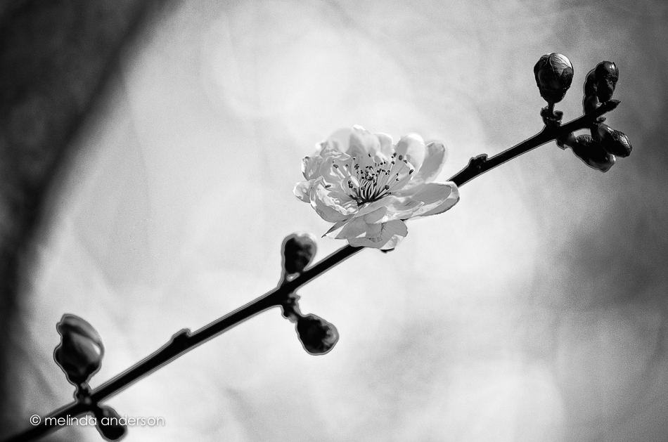
The above is another view of a plum blossom- converted to black and white.
And below is a macro of a blossom on the verge of blooming! I textured this one with two layers of Daisy and just a touch of Anna, whom I added because I like her so much better than Daisy 🙂 ( from the Downton Collection by Kim Klassen)!

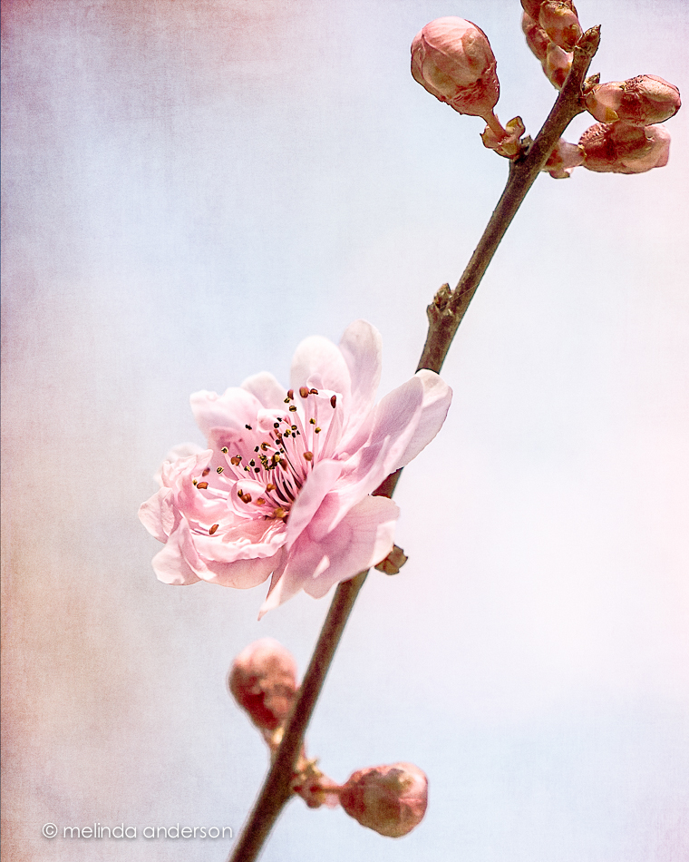
Last Friday, I photographed this blossom- one of the few on my flowering plum that day. Today the tree is covered with blossoms.
I used 3 layers of texture in my edit- more than usual for me- because I was attempting to tone down the pinks (the blossoms) and the blues (the sky) in the background. Much as I appreciate the springtime colors in my otherwise drab garden, the effect in the photo was giving me flashbacks of the wallpaper in my childhood bedroom. I loved it when it was put up, but as I grew older I found the pink and blue flowers babyish and frilly and girly. Daisy and Sybil from Kim Klassen’s Downton textures muted the background, while Cora kept the blossom pink. 🙂
I’m still reeling after Sunday’s Downton Abbey finale! I knew something major was going to happen- and I’m still getting over the earlier tragedy (not specifying in case you aren’t caught up). Too much action for one season= but I do think this opens up lots of plot possibilities!
Follow the link at the bottom of the page to see more photos using textures from Kim’s Downton collection. Happy Texture Tuesday!
P.S. I removed the footprints from yesterday’s beach photo- the incompleteness of them bugged me. Next task: add MORE footprints to the black and white version- MAYBE! Check out yesterday’s post for the update.
After 41 years- it must be love!
Today’s theme for Texture Tuesday is love. I conceived this photo originally in response to a Clickin Moms’ creativity challenge, Body Language, and thought it would be perfect for Love as well. And I got another excuse to wear my favorite valentine socks from my teaching days! 🙂
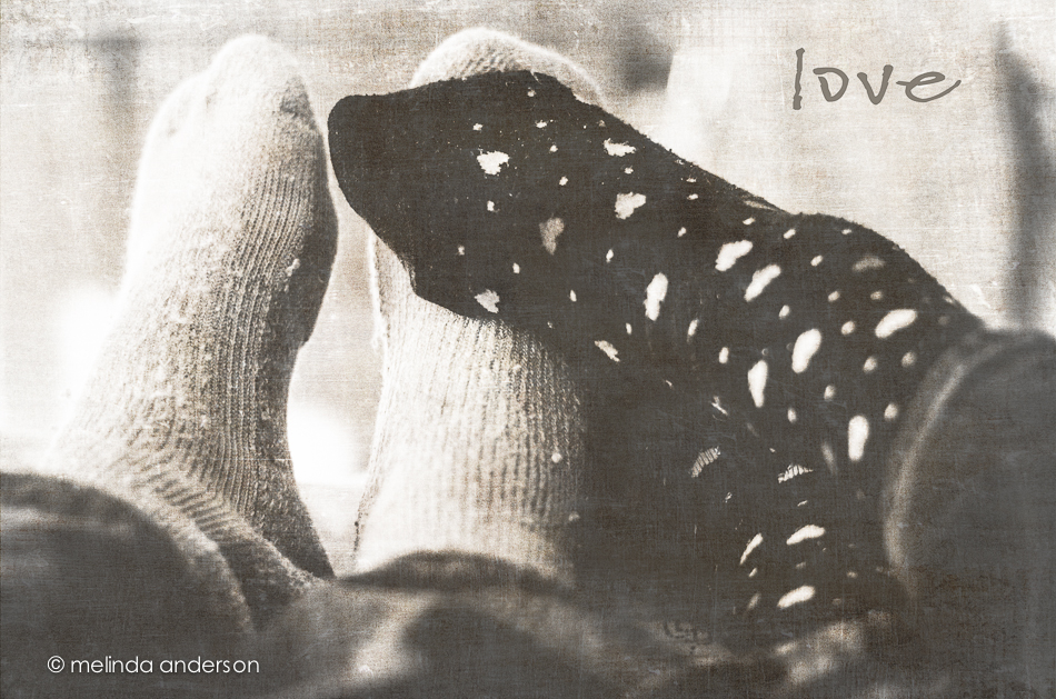
I played with this one a bit, converting it to black and white-and then adding a layer of Mary, one of Kim Klassen’s textures from her new Downton collection. Since Downton Abbey is my most favorite TV show, I love having these new textures named after the the Crawley women. I wanted to use Sybil, but the tones of Lady Mary’s texture worked better with the image I had in mind. Next time, Sybil!
To see some beautiful textured images centered around a LOVE theme- head on over to Kim Klassen’s site.
Our plum tree has its first blossom- a hopeful sign Spring is on its way.

This photo was layered with two layers of Kim Klassen’s minus 43, one with soft light, one with multiply blend mode.
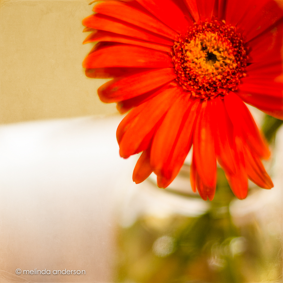
It’s Texture Tuesday- and the challenge was to create an image with a POP of color. Not thinking outside the box, I headed to the store to buy some gerbera daisies, my go-to flower subjects and favorite cut flower. And I used my go-to texture, Kim Klassen’s bent edges, which I desaturated and mostly brushed off the flower itself.
My second assignment for Beyond Beyond (aka 2B), was to practice using various apertures and look at the resulting depth of field- and then to have fun using editing techniques in Lightroom and Photoshop. The suggestion was to use Kim’s image of a white bowl of pinecones on a white chair, giving it a different look in processing. Well- I have pinecones and a white bowl and a white chair- so I took my own photos.
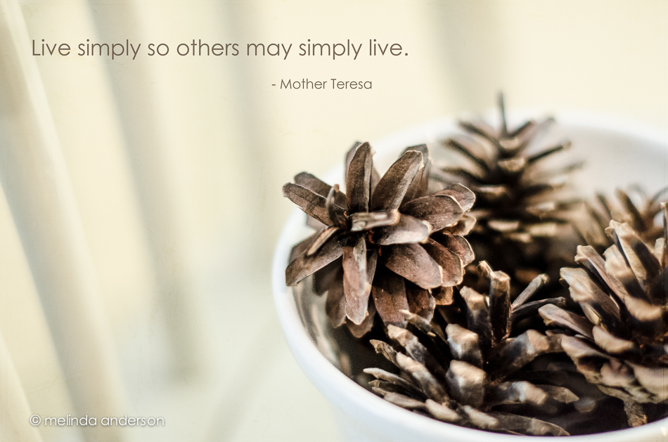
I used one layer of Kim’s texture, simplistic, at 65% opacity and desaturated the image slightly to get rid of my yellow walls. I googled simply to find an appropriate quote and found this one attributed to Mother Teresa. After editing, I discovered Kim had used the same quote (except for one word) attributed to some one else. Oh well- you can’t trust the internet!
This week’s Texture Tuesday’s link-up features Kim’s new texture, minus 43, which was the temperature (including wind chill) where she lives in Manitoba when she created it. I wanted to have some SNOW in today’s image, so I had to go back to a photo I took in November, when we were at Yellowstone.
It was a gray day with flat light- but still beautiful in the stillness of late autumn when the park is closed to traffic.
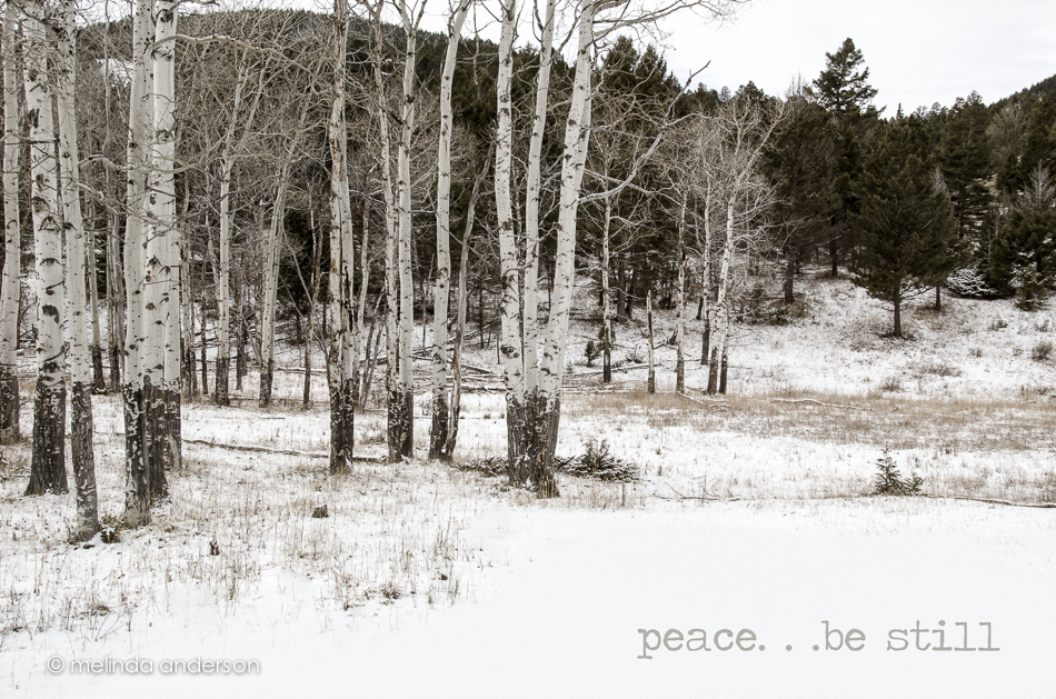
I used one layer of texture, which I desaturated slightly, and reduced the opacity.
Where have I been? I can’t believe I’ve never done this before!
I was looking through the tutorials and challenges from last year’s Beyond Layers class and discovered this activity. You go through your books (or go to the library) and find some book titles that you stack to make a poem. Teachers- wouldn’t this be fun? This was a quick five minute attempt- and is kind of a cheat, because the second title is kind of a poem all on its own- but I like it just the same. I want to try it again!

Textured with reentry by Kim Klassen at low opacity.
I’m kind of on a roll at my kitchen table these days right- so many of my photos have been taken here lately (most not posted). I discovered the afternoon light from the window a while ago- and more recently I’ve been entranced with the curve of my very ordinary kitchen chairs. This photo was NOT taken in lovely light and really posed a challenge in terms of exposure. I finally went with blowing out the background- maybe in afternoon light I could get a better background.
I shot this photo is response to a theme from my daily challenge group on Flickr- FRAMED. And what better frame than a kitchen chair?
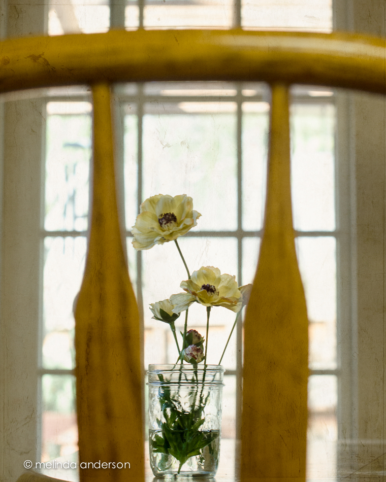
I used simplistic, one of Kim Klassen’s lovely textures (2 layers- one at soft light, one multiply, reduced opacity) and am using this image for my Texture Tuesday link-up. Check out more images created with Kim’s textures by following the link at the bottom of the page.

It’s finally Texture Tuesday again! I think it’s been a month since the last link-up. I’ve missed it, especially because I finally have enough time (famous last words. . .) to participate each week now that I am not doing a Project 365. So, unbelievably, the theme this week is cuppa– and I have the perfect photo- another view of my beautiful new cup and book. Because I used them as the subjects of last Friday’s post (scroll down to see) , I changed things up a bit and did a black and white conversion with a bit of a silver tone prior to adding texture. I almost never add textures to black and whites, but I think it works well here. The textures are return (low opacity) and reentry (100%), two of Kim Klassen’s latest.
UPDATE: When I went to link up today’s post to the Texture Tuesday page this morning, I discovered that Kim Klassen had used the exact same cup in her post for today (and she also had just received the cup as a gift!)! I’m thinking this must be a sign of good things to come!
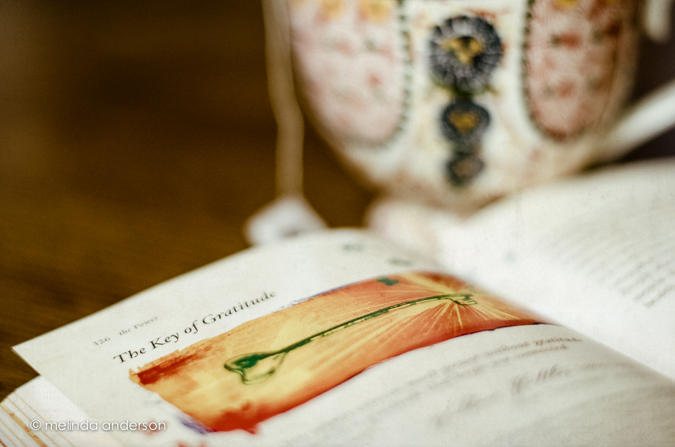
Gratitude is my favorite spiritual practice. The act of appreciating what is present in my life immediately turns around any worries, self-doubts or complaints circulating around in my brain, and I begin to experience peace.
One of the themes from my Flickr group this week is spiritual. I chose gifts that I recently received from two friends in my HeartMath group to represent the practice of gratitude. One is a beautiful (and wonderfully huge!) tea cup from my friend, Carolyn- and the other is The Secret:The Power, a gorgeously illustrated book by Rhonda Byrne from Eline. I have such thoughtful friends!
The photo is textured at low opacity with silence by Kim Klassen.
