 Continuing the theme for Beyond Beyond

Continuing the theme for Beyond Beyond

Our assignment this time is to shoot as many apple photos as we can over the next week. Of course I started with a macro- taken with the camera on a tripod and using a long exposure, no special processing.
Expect to see a few more apple photos over the next week!
Spring is definitely happening in Benicia, despite a brief rainstorm. I’ve been a bit under the weather lately and haven’t done much photography except around my yard. Thank goodness for flowers, always around waiting to be photographed!

This week’s Texture theme is POP! For me, no color pops more than RED, so here we go. . .

Textured with two layers of Kim Klassen’s cool grunge.
I am eternally grateful to my macro lens for providing me with seemingly endless photo subjects. Here’s a sample of what I found in a kitchen drawer- and on the counter. I purposely used a shallow depth of field on all- just because. . .

The theme for this week’s lesson was I Collect. Kim Klassen showed some of her collections of photos, books, and memorabilia dropped artfully on the floor. I chose to instead quickly drag out some of my family memorabilia that I have acquired over the years and arrange them on top of the old dental cabinet where they normally reside inside drawers. During the two years that I did a Project 365, almost every item pictured here was featured on my blog. I am an avid family genealogist and lover of all things antique and am now, in my later years, trying to figure out what I really want to keep (everything in this photo, for sure).

The other part of the lesson was to ponder our STYLE in photography. I’ve seen this topic bandied about on the Clickin Moms forum; I think it is probably more of a big deal when you are a pro. For me, I know I like bright colors AND black and white photography AND strong compositional elements. I rarely like haze and matte processing in my own images, except in some of my lighter floral photos- but I like it in the work of others. I love landscapes- but don’t feel particularly competent in achieving the look I admire in the work of other photographers. I’m not too worried about finding my style, but hope it is evolving as I learn.
Photo processing notes: Although I didn’t do anything special photographing the little scene above (tripod, door open for light), I did try something new in processing after doing my basic edit. I used a free “hand-tinting” preset from OnOne software (I have their Perfect Effects 4). What it did was convert the photo to black and white, but bring back anything that was colored brown (by desaturating blues, greens, etc). I chose this preset, because I didn’t like the blue color of the writing on the Hopalong Cassidy mug in the cabinet amid the brown tones of the image. So basically, almost everything was left in the brown tones except the mug- easier than using an adjustment brush. In Photoshop, I stretched the canvas as we learned in a previous lesson and added a texture to just the bottom section.
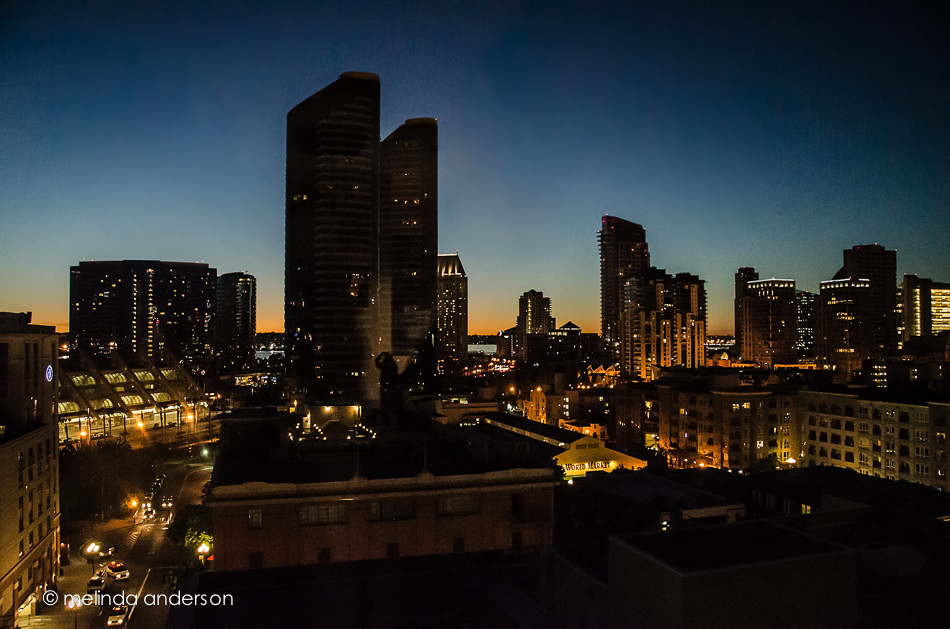
This month’s Clickin Moms blog link up challenges us to shoot through glass. Off and on during the month, I would think of the topic, but never seemed to be anywhere where an idea just jumped out at me. I did a few lame attempts at home, and finally settled for some shots at my church this week. But I do offer up these photos from LAST month’s trip to San Diego where I took a few shots of the spectacular view of downtown San Diego from my son’s apartment. I did not use a tripod (tsk, tsk) and shot at a very high ISO (6400!) so yes, there is digital noise! And what did I learn from taking these photos? Use a tripod! Check for reflections (they are almost impossible to edit out). Do it right the first time- our son has since moved to a new apartment, and I will never have the opportunity to retake these photos.
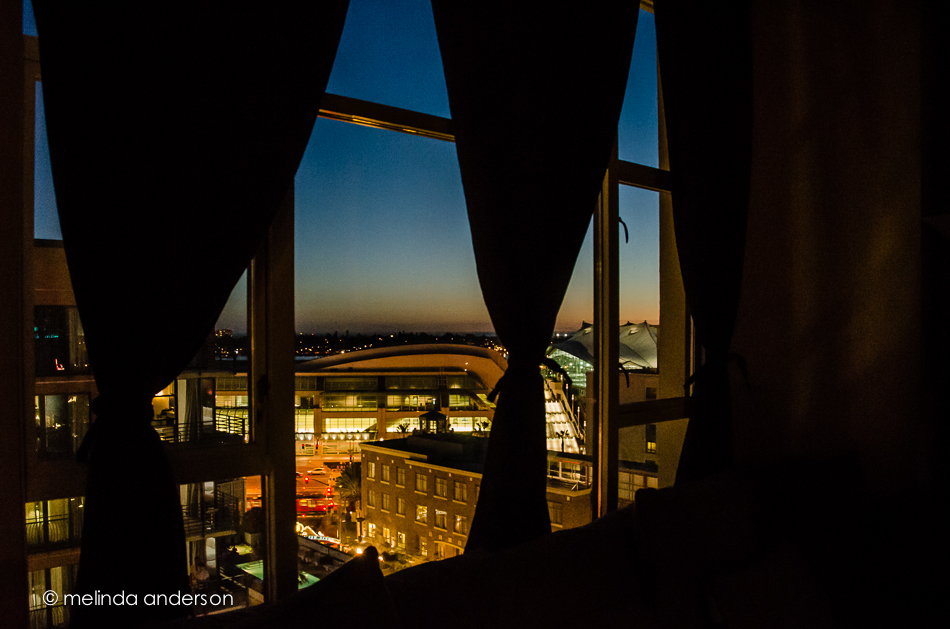
To keep myself honest, here are a few photos I did take this week. They are through glass, but not quite with the dramatic view. . .
Flowers as shot through the sliding glass door of the sanctuary at church:

This is almost the same view- but with the focus on the door. Hmmm, the glass isn’t quite clean!

And here is the stained glass over the door, shot from inside:

There are some wonderful creative photographers in our blog circle. If you click on each link in each photographer’s blog, you will be able to make the complete circle and end up back here. Start with Jennifer Bantle’s blog!
Trader Joe’s had some little pots of lavender for sale, so I snagged one that was wilting rapidly in the afternoon heat yesterday. It has perked up nicely today, and it is now blogworthy! I do love lavender, and am so happy to have it in my yard again!
 Taken with my macro lens and texured with Kim Klassen’s 1301 and sybil textures.

I rarely desaturate a photo to this degree- and I NEVER EVER use a white vignette. Never say NEVER!
I started with a Lightroom preset from Matt Kloskowski (he offers them free on his blog); this one is called Wedding Fairytale. I’ve actually used it a few times for flowers (it would be great for newborn babies too, I think); it’s a good one! I added a layer of Kim Klassen’s 1301 texture and this quote from Bill Cunningham, a street fashion photographer for the New York Times (this week’s Texture Tuesday’s challenge is to add words to our photos).
Speaking of beauty, head on over to Kim’s site for some links to beautiful textured photos; the link is at the bottom of the page.
My husband loves to plant geraniums in pots on our deck- they are colorful, they live forever, and they can take a lot of neglect. Here is a macro of some tiny geranium buds- if you look fast, they almost look like roses, don’t they?

Textured with 2 layers of Kim Klassen’s 1301 and one layer of Cora.
Our lesson this week had so many great tips and tricks! We learned animated GIFs which I had tried once before, selection tools in Photoshop (including one that makes me want to upgrade to CS6), working with curves in Lightroom, and extending the background on a vertical photo so that it fits better on your blog.

As you can see, I really took that last lesson to heart. Here is a vertical image, nicely extended into a somewhat horizontal one, which fits so much more nicely on this page. What you probably can’t see is that I played with the Lightroom curves tool, adding haze and lightening some of the colors, AND I took it into Perfect Effects 4 and added a sky with clouds (with much reduced opacity so that it blended in with the original sky)! Although I haven’t made a new animated gif, I feel like I got my homework DONE!
By the way, this photo is from our trip to San Diego in March.
Yesterday I had a wonderful morning photographing flowers and plants in our backyard and then editing them with textures. This is why I retired!


Textures are from Florabella.
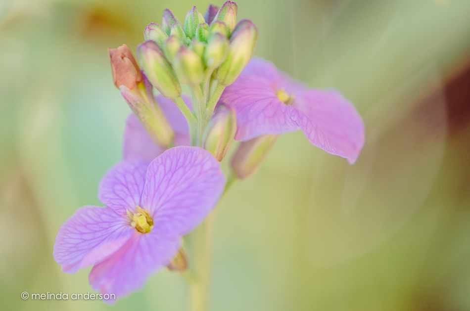
I got out my macro lens again, this time capturing some of the bits of Spring around our garden.

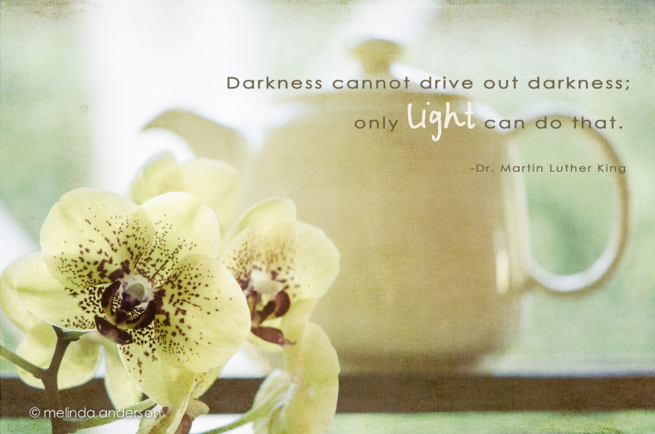
In the wake of last week’s tragedy, I thought of this clip I saw on Facebook a few months ago. Such wisdom from Mister Rogers . . .
For Texture Tuesday- edited with two layers of Kim Klassen’s 0303 texture.
Last Friday, my husband and I finally got to visit Famous Mo’s, the new coffeehouse and theater in Rocklin opened by my college roommate, longtime friend, and photo buddy, Carol Smith. We were not disappointed- great food, a cool atmosphere, friendly staff, and fabulous coffee! We were there in the daytime, so missed out on the nighttime music scene, but we will definitely be back!
Carol had just learned to make lattes the day before, and this was her first made for a customer- me! It was delicious- better than Starbucks’ (sshhhhhh. . . )!

Carol and her business partner, Jesse Horn have created a terrific place to go have coffee, lunch, or snacks during the day and to experience great entertainment on weekend nights. Carol’s creative touch is evident in the menus, signs, and even the photos on the walls. Check out Famous Mo’s website and Carol’s photo blog to find out more about Carol and her great new coffee and entertainment spot!
