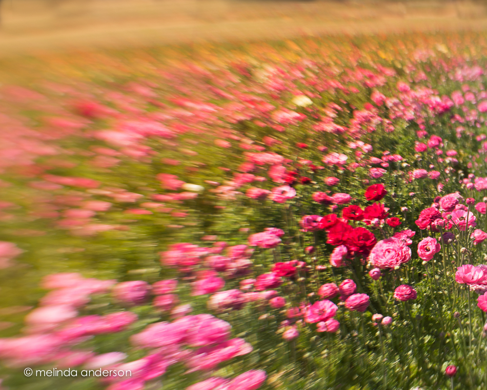
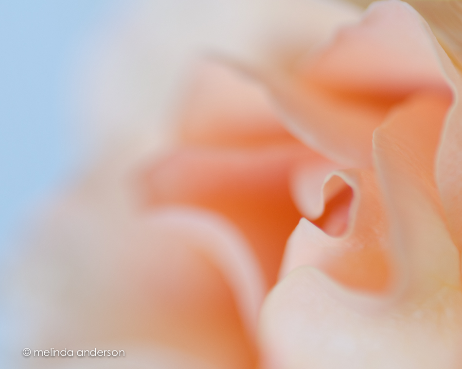
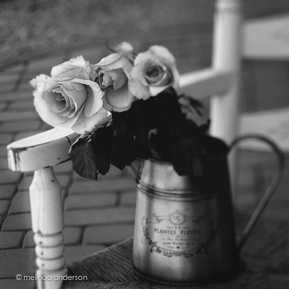
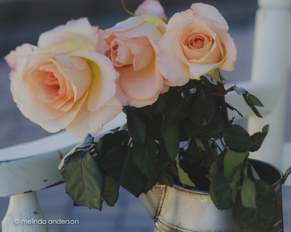
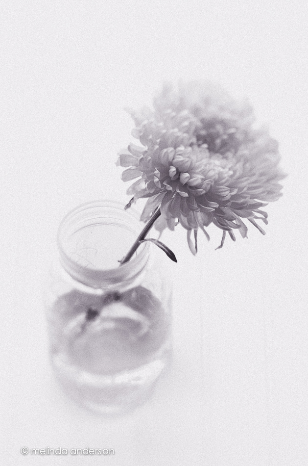
When we were in California, we stopped at a beautiful flower farm, where there were acres of ranunculus blooms. Of course I took dozens of photos, but somehow they never made it into the blog. Here are a couple of my favorite images; expect to see more soon!
Crated
One of our recent assignments in Bestill52, was to create a still life in or on a crate. I have had two pepsi crates since our early married days. One is for individual bottles; the other is for 6 packs, I think. Because this was before the days of shabby chic, we stained the crates to make them darker (and to go with our antiques). They hung on our walls in each of the places we lived, until we moved to our Arizona house. I haven’t quite decided what to do with them here, but they work well for still life props.
All 3 images were taken with the Lensbaby and Edge 80 optic.
Sunflowers: Light and Shadow
Back in the studio again! Spring is really here, and it was actually pleasant to work on still life assignments in the garage. Here are my “official” light and shadow images for The Studio.
Playing with Kim Klassen presets:
top row- moody-ish, organic
bottom row: chocolate, barely color
This one is a more standard, “clean” edit.
Light, Shadow, Light
The latest prompt for Kim Klassen’s Studio had to do with light and shadow, which she related to ups and downs in her own family. It was easy for me to use that metaphor for the twists and turns that have been part of our 2015. Life has been mostly wonderful, but we have stepped into the shadows a few times in the last couple months.
Although I considered this theme, I have not yet done the still-life assignment. Instead I took some sunrise lensbaby shots of the sunflowers I bought the other day (that I had INTENDED and STILL INTEND to use in a shadowy still life). Somehow, I always find myself drawn to impromptu still lifes, rather than styled ones, and in this case, the morning sun on the sunflowers was too beautiful to pass up. There is shadow in these images- but the light is predominant.
Retro Blur
I found myself playing with my Lensbaby Mobile recently. Although it really is a cool little lens for the iPhone, I hadn’t been using it much after I got my Composer Pro and optics for my Nikon. As I’ve mentioned before, Nik Snapseed is my usual first stop when editing my iPhone photos, and this time, it was my ONLY stop. It has a cool little set of filters within the app called retrolux, which give a desaturated, vintage look (actually 12 looks) with lots of options for adding or removing scatches, light leaks, vignettes etc.
The photo on the left has been edited with Snapseed only, and the one on the right has several Kim Klassen textures added in Photoshop on top of what was done with the retrolux filter. It’s hard to spot the differences- just a little more texture, a little less haze and a slightly darker flower.
BLUR
I love the soft and dreamy Lensbaby look for flowers. I was missing my Lensbaby this week, so I spent a few hours playing with some flower macros I took when my Nikon was still functioning.
I love black and white- even for flowers- so had some fun editing this image 3 ways. I created a preset a few months after I started with Lightroom. It’s kind of a dramatic, over the top black and white with some tones applied that I first used on a photo of the Clocktower in Benicia. Although it doesn’t work well with most images, I still find uses for it occasionally. For this daisy photo, I first applied the preset at 87% (using the Fader plug-in). The second shot has the same preset applied, but its effect is reduced way down. The third photo is edited the same as the second, but has a texture added at low opacity.
One of the things I love about Lensbaby macro images is that they have that soft, painterly look without adding texture.
But, often I feel that a texture adds to the look I want, as in the image below.
Just Having Fun
And again, once more . . .
Pink Carnations
Here’s another view of the teacup filled with mini carnations. I was trying to do a take on the dinner plate art assignment for The Studio- where you artfully arrange food (or flowers, leaves etc.) on and around a dinner plate in an artful manner. Symmetry and precision have never been my strong suits, and I feel totally out of my element doing food photography- so I gave up after maybe 10 minutes. I put the dibs and dabs of leaves and flowers to the side and stuck with just the flowers in the cup- and one stray one on the saucer. I am in awe of those who create these beautiful tableaux- but it’s just not me.
Fleeting Glimpses
Just for a day. . .
Editorializing
Our latest challenge in The Studio was to create a photo that is editorial-ish. I was pretty stumped until I went to bed last night and somehow came up with using the daffodils I had purchased yesterday at Trader Joe’s in this still life. I had been thinking of using one of my little Adirondack chairs in a composition, so it all came together in about 10 minutes. Adding the text took longer- way longer- as I always have to try out every font before I’m satisfied (or tired of it . . .).
I took the photo below a day or two ago, and it kind of fits into the “editorial-ish” theme as well. In fact, the newspaper is opened to the editorial section! Here I was painting hearts to add to a still life you will be seeing tomorrow!
Tuesday Flowers
I must admit that flowers are still my favorite photography subject. I wish I had a green thumb and could grow them as well!
The roses below were textured with Kim Klassen’s kk_anna texture.
And here almost the same shot converted to black and white (no texture applied).
This is a closer view of the flowers edited using Kim’s kk_likeadream preset in Lightroom.
All photos were taken using the Lensbaby.
Linking up with Texture Tuesday today.


