Melancholy and iPhone Fun

Since I’ve been back, I’ve been catching up on life, and my photography work has consisted of culling and editing photos from Yellowstone and getting images edited and printed for my photography groups.  I was also 2 or 3 weeks behind in Start to Finish and Be Still 52 (Kim Klassen’s classes), but knew I would have time to catch up soon.

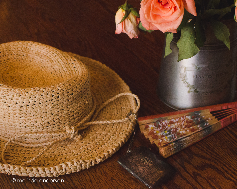
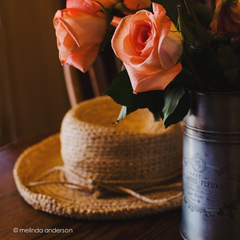
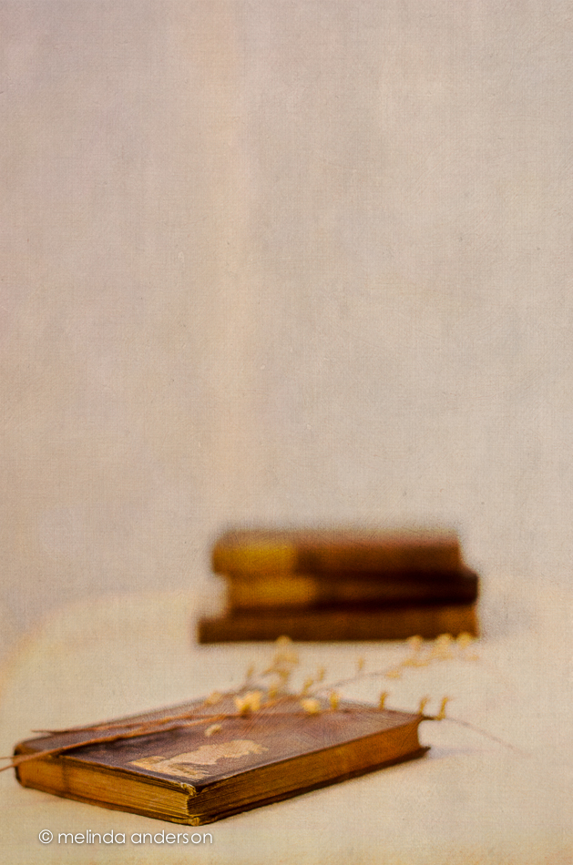
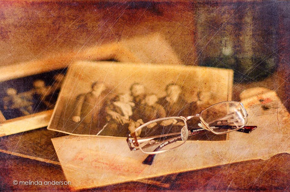
A couple days ago I started going through the lessons I hadn’t done and found myself feeling inspired again to create a still life. One of the more recent lessons included a preset called melancholy– and a suggestion to revisit the whole wabi-sabi idea, which I loved. I enjoyed creating this image, which is very different from my usual shooting and processing style.

10June2014-0081-Edit

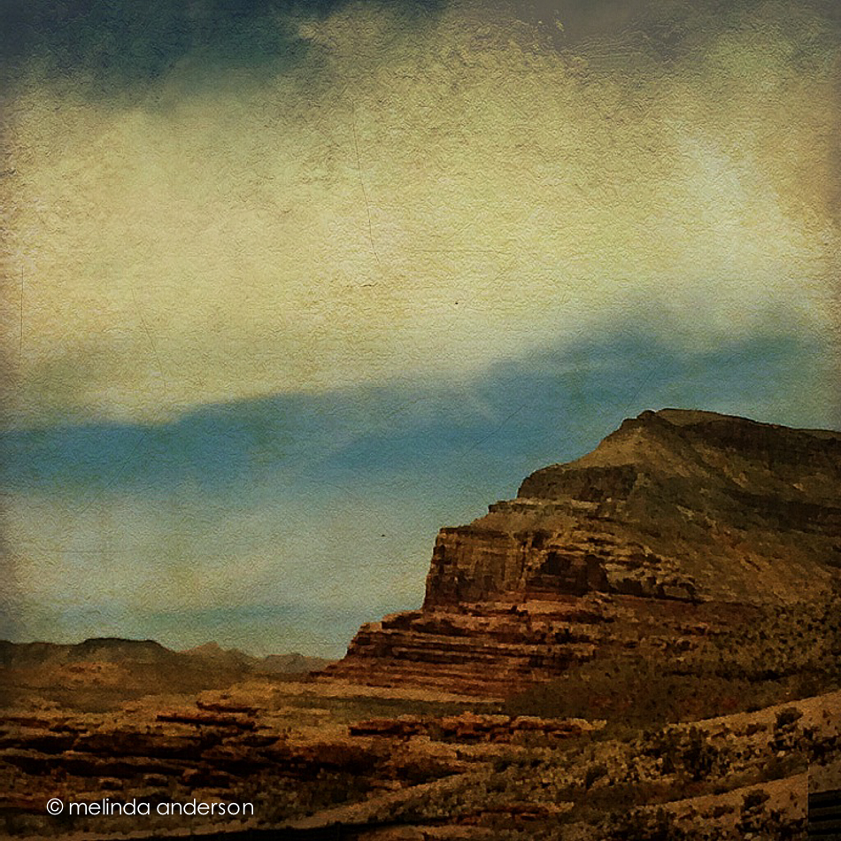
And now for a couple random iPhone photos. I didn’t take many photos this week, but did enjoy processing them.

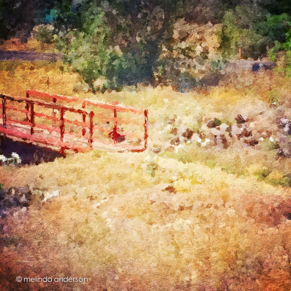
This is the bridge (over a dry wash) that we cross when we walk the trail at Willow Lake. If you look closely, you can see the white southwestern prickly poppies that are in bloom along the trail.  The basic edit was in Snapseed- and then I used one of the filters in Glaze (an app that I really don’t understand) and added some textures in Mextures, which also gave it a vignette.

Photo Jun 10- 11 23 03 AM

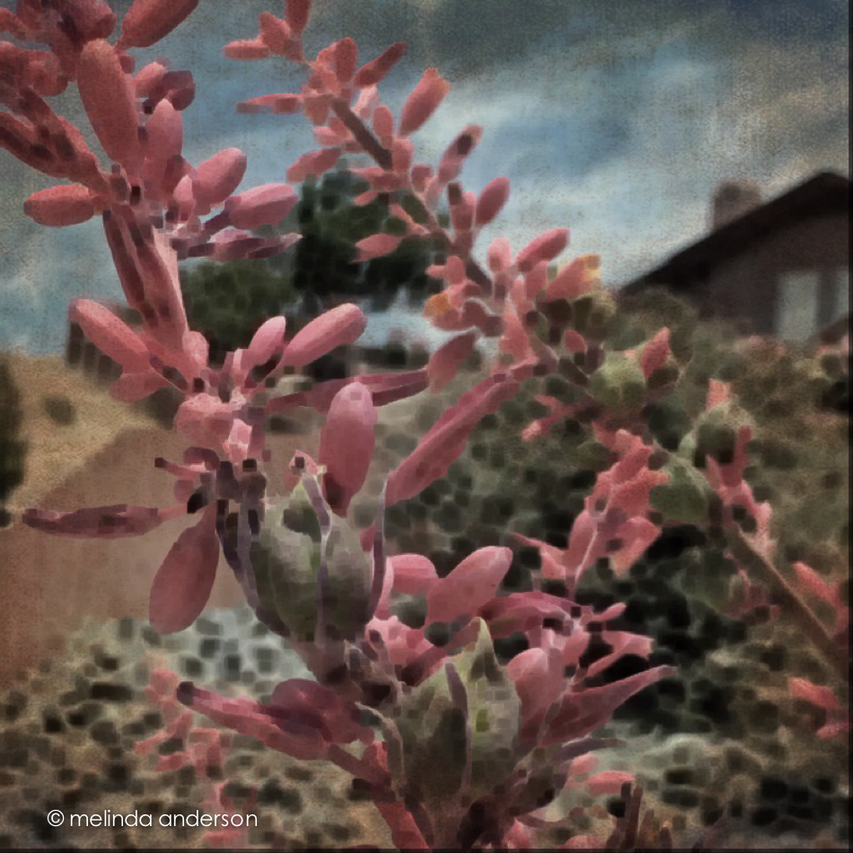
The photo below was taken in our front yard and is a closeup of the flowers (and fruit?) of a spiky foundation planting in our flower bed.  Now that it’s blooming, I notice this plant everywhere we go in Arizona. Last fall I cut off many of the dried stalks and put them in my old milk can on the front porch. You can see what they look like dried here. I edited the photo in Photo Wizard, which is a great app for basic editing (it even has a curves adjustment!), as well as having a zillion special filters and effects, from textures and vignettes to motion blur and a bathroom glass filter.  I have yet to explore it fully- guess I need to go on another road trip!

Photo Jun 10- 11 42 09 AM

I’m linking up with App-happy Wednesday again!

Keeping With The Times


App Happy and Catching Up

It’s App Happy Wednesday over at Keeping With the Times, so I’m posting a couple road trip/through the window shots today.  I’m also catching up with my Start to Finish 2 Lessons, so my still life images are on here today as well.

First the iPhone photos! After a day and a half of driving (actually riding, as my husband- who has been suffering from allergies and asthma- was doing ALL the driving. . .), I was happy to see red rock as we got to southern Utah, a sign that we were close to Arizona. I think the first shot was edited in Snapseed, and then I added the text/graphic with Rhonna.  The second photo was edited in PS Touch, because I needed to do some cloning- and then I added texture with Photo Wizard.

Photo Jun 02- 10 49 02 AM

Photo Jun 02- 12 24 55 PM


Now for the Start to Finish lesson! The assignment was to create a still life that included eggs.  Hurray- something I actually have! No browsing in antique stores for me today! I realized straightaway that still life photography is still challenging for me. I feel confident in the photography and the processing- but not with the styling. I am so in awe of my classmates and their styling ability! I found that what works for me is keeping it simple; when I add too many elements, it all falls apart.

3June2014-0043

This above image was one of my last shots. Filling the frame and using a shallow depth of field- definitely my comfort zone!

3June2014-0016


The above macro shot may not technically be a still life- you barely notice the other eggs!

And here is a from above shot, which I do love doing.

3June2014-0019-Edit


I found myself opting for a darker, more matte processing style today. The blue and brown tones seemed washed out with my usual editing, and I found reducing exposure and using a matte curve gave me the look I was going for.  In Photoshop I added Kim Klassen’s simple texture- and called it done!

I also played catch up with some Flickr challenges- and discovered that one of them, fast food, worked with my egg theme!

3June2014-0005

No special processing here- just a quick Lightroom edit.  This might be my favorite of the day!


a rose is a rose is a rose

This might be the last view of these beauties.  In Lightroom, I  did a black and white conversion (to go with the black and white theme for this week’s Texture Tuesday), and some split toning to add a hint of pink. In Photoshop, I applied three textures at very low opacity (jacob, lovely lavender, and patina) and called it done.

12May2014-7245-Edit

Roses- and Moonlit Wind Turbines

My Mother’s Day flowers came just in time- I was running out of things to photograph for a still life!  This is my favorite shot so far of the beautiful roses given to me by my husband.

12May2014-7255-Edit


Since this is App-Happy Wednesday over at Keeping with the Times, I’m also including an iPhone photo.

This week, I got a fun new (to me) app called Distressed FX; I tend to pick new apps when I see others using them on Instagram.  I confess I fell in love with the app when I saw you could add flocks of birds to your photos.  Two things about this photo: 1) the subject is wind turbines in the moonlight (I’m kind of obsessed with photographing wind turbines on road trips) and 2) I wanted to fade the texture, but couldn’t find my original to blend with it (and besides, the birds would have faded too).  I know I could have done something with Adobe Photoshop Touch, but didn’t take the time to figure it out. I have a lot to learn!

Photo May 10- 9 43 20 PM

Yellow Tulip

I haven’t totally abandoned old books as props; here’s a “basic reader” from 1931 with a tulip from my Mother’s Day bouquet (thank you, Matt!) as bookmark.  As a former first grade teacher, I have a small collection of old primers and readers that I bought at garage sales or somehow acquired over the years.  The theme for this week’s Texture Tuesday is yellow, so I added the yellow tulip. This image is textured with teatime by Kim Klassen. I’m also including another shot in black and white.

10May2014-7230-Edit10May2014-7233


Books, Shells, and Keys- and the Mystery of Room 217

This week I can honestly say I thoroughly enjoyed doing my still lifes for Kim Klassen’s Start to Finish class. I am slowly getting into my groove, and I think it’s because I’ve been photographing some of my old books, which I dearly love. And for a little twist, I’ve added keys and shells into the mix of props. As I’ve taken my photographs over the course of the week, I found myself imagining they were book covers for books I want to read, which made it even more fun. One of the keys (which my friend, Debbie found at a garage sale) appeared to be a hotel key- for Room 217. My imagination went wild with various ideas of what the story would be that featured that key on the cover.

booksandkeys2

booksandkeys1


untitled-7001


All except for the last photo were textured using rue, retreat, or teddy from Kim Klassen.  I think my favorite shots are the last two.

I’m linking up with Kim’s Friday Finds today. What did I find? A still life subject I’m comfortable with- and a bit of confidence!


This and That

My camera has been out a lot the last week; here are a few photos that didn’t make the blog.

A couple Blue Ridge cups

3May2014-6750-Edit


A macro of a leaf, snapped while watering

5May2014-6902-Edit


And from Chalk It, Prescott’s chalk art festival last weekend

4May2014-6827-Edit


Have a Happy Thursday!

Morning Tea

The sun streaming in the window this morning made it easy for me to decide where to set up my shot today.  I actually photographed my Texture Tuesday photo on Texture Tuesday- just like I did in the years I was doing my Project 365, when the photo posted each day had to be taken on that day.  No such self-imposed pressure now, but I just somehow never got to it until this morning. This was one of my grandmother’ teacups and one of my mother’s old books.  The key is one I borrowed from my friend, Debbie. The textures are Auineau, anna, and celebrate. Have a great day!

6May2014-6972-Edit

Negative

My friend and fellow photographer, Carol (infocusdaily.com), and I have been talking about the use of negative space in our images.  In looking through some still-life photos I took Saturday, I found one that definitely has negative space- more than I usually use in my photos. This was taken in my current home studio- the hall bathroom- that’s a shower curtain in the background!

26Apr2014-6344-Edit


In search of my still life mojo. . .

In the hopes of finding my still life photography mojo, I’ve taken on two of Kim Klassen’s photo classes- Start to Finish and Be Still.  Both emphasize still life photography, a genre where I often feel awkward and uninspired. After two years of doing a Project 365 and another year and a half of regular photography blogging, I have taken photos of almost everything in my house- actually two houses! Time for some new inspiration!

My intentions for this class are to learn some new skills and to create some photo art that is truly my own expression.

I am just beginning to gather my props and was delighted yesterday when a package arrived in the mail that contained the family history items that my husband had gathered from his father’s home during last week’s visit to Kansas. Yay- props! You might notice a Mason jar in the background- it’s new! I had asked my husband to look in his dad’s house for some jars; when he mentioned it to his sister, Kathy, she gave him one of hers to give to me. How awesome!

24Apr2014-6186-Edit


This photo is edited using some of Kim Klassen’s older textures- soft grunge, archives, abstract, and scratchedmagicjuly.

I’m linking up with Friday Finds as well as my Start to Finish classmates.

Kim Klassen dot Com


Create

Simple is this week’s Texture Tuesday theme. I tried not to overthink it, so decided on a simple composition, a few textures, and a black and white conversion.

21Apr2014-6103-Edit-Edit


textures: bamboo, sophia, and canvasback by Kim Klasse

Wabi-Sabi

I learned a new term last week on Kim Klassen’s blog- wabi-sabi.  As I understand it, wabi-sabi is a Japanese aesthetic embracing the imperfect, the incomplete- the natural, the simple and unaffected- the moment just as it is.  The perfectly imperfect.  The now. A philosophy for art, living, relationships- I could go on. I love it!

I used that new (to me) term in completing Day 52 of Beyond Beyond.  This lesson gave us a new template for Lightroom and Photoshop and challenged us to print a photo- and use that photo in another photo.  A picture in a picture- which reminds me of the opening of each episode of Modern Family, a show I’ve only discovered in the last few months.  Kim’s example was a picture in a picture in a picture, so I did this too.  I’d like to use this technique again with people- perhaps my favorite models, Miles and Henry.

I chose a Mason jar to photograph, this time with flowers, because of its wabi-sabi-ness! It is imperfect, utilitarian, and simple, and I love it.

mason_jar_layout

2B_wabisabi_ pic_in_picYou might have noticed that my blog has a new look. It’s been well over a year since I’ve made any changes, so it seems like time for an update.  I went back to my original layout with a new header, and made some corrections on my “about” page (it still said it was 2013 and that I live in the San Francisco Bay Area- oooops!). The slideshow is gone, and I have my sidebar back. There are other little changes I want to make as well- after I figure out how to do them.  So what do you think?

Perfectly Imperfect

A few years ago I attended a knitting workshop. I was knitting along and noticed I had made a tiny mistake quite a way back in my project.  Upon noticing my dismay, the instructor launched into a speech saying that it is the tiny imperfections that show the difference between handmade and machine-made. Handmade is made by a real person with skill and care; machine-made means, well, made by a machine! I’ve always thought of that when I look at the hand-painted designs on the pieces in my Blue Ridge pottery collection.  Each plate, cup, saucer, bowl etc. was painted by hand, making no two pieces alike, even those with the same pattern.  Perfectly imperfect (which just happens to be the theme for this week’s Texture Tuesday) !

14Apr2014-5893-Edit

Although I have almost an 8 piece set of one pattern, Sun Bouquet, I usually mix up my table settings and include pieces from several patterns.  Most of the patterns I look for are in primary colors, so they blend well together.  And there’s my newest Mason jar (yes, I now have two) in the middle- it’s perfectly imperfect as well!

Edited with two of Kim’s textures, 1301 and sybil.  Linking up with Texture Tuesday today.