I took some time to catch up on some of my Flickr challenges- and I was in a monochrome kind of mood.
This one is for the theme, one.

And this one is for empty.


I took some time to catch up on some of my Flickr challenges- and I was in a monochrome kind of mood.
This one is for the theme, one.
And this one is for empty.
There haven’t been any Beyond Beyond posts from me in awhile- not just because I am behind (I am), but because Kim Klassen’s husband has been seriously ill for awhile. Thankfully, he is on the upswing now, and Kim has been able to resume her Beyond Beyond challenges and tutorials (as well as put out a new set of textures- The Waterfront Collection!). She gave us a sample texture from her collection to use in our images, as well as a preset, which is dark and earthy and desaturated.
I chose to photograph my mini-pumpkins which I have continued to display after Halloween (along with some gourds). It’s fall! I followed Kim’s instructions exactly (for once!), because I really like the tones and the desaturated effect. Both images use her preset, but only the first has the texture. Unfortunately my photo is so dark that the texture is hard to see. I did use her sharpening technique in the first one also- and you can REALLY see that!


Kim Klassen started a new link-up a while ago called Friday Finds. I hadn’t planned to participate, but I found fresh lavender last night at Trader Joe’s- does it count if you find it on Thursday?
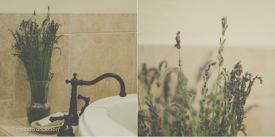
I used a matte edit- not my usual style, but I think I like it here.
My children went in together on a birthday gift this year- one to always remind me of Benicia, since we are getting ready to relocate.

Isn’t it beautiful? Benicia is known for its glass studios, so this gorgeous red vase will always remind me of my 26 (and counting) years in this wonderful little town (and of my two grown up children collaborating on a gift!) as we prepare for our next big adventure.
Kim presented a mixed bag of Lightroom and Photoshop tips, as well as some iPhoneography tricks.
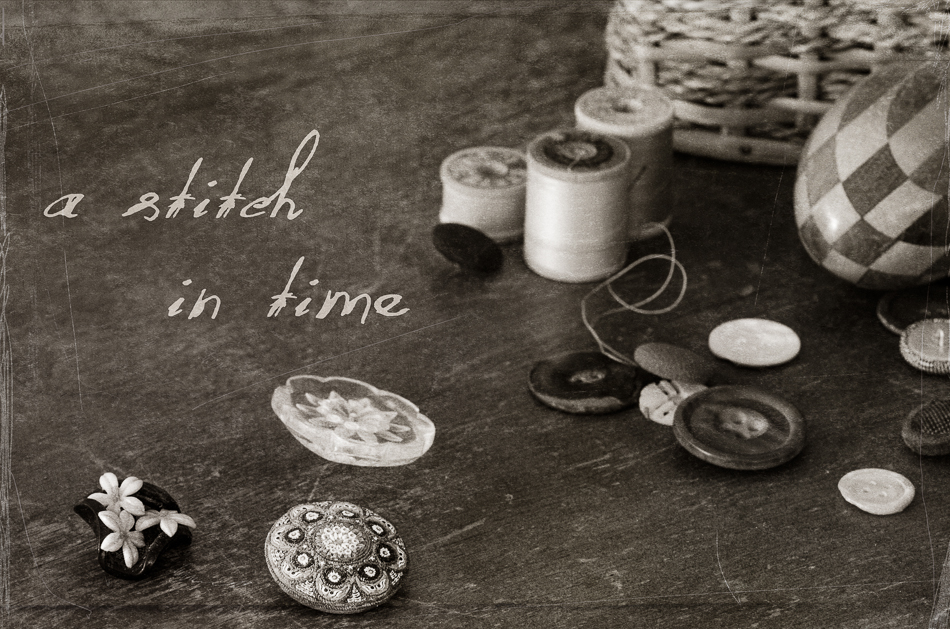
Here is my grandmother’s sewing basket (decluttered!) and with some of her mother’s buttons in the foreground- and her darning egg. I desaturated the image and then added the kk_desert texture, which did a great job of masking the scratches on my old dining room table by adding new ones from the texture.
I don’t usually do much with my iPhone photos. I use the camera when I don’t have my regular camera, and I do edit them in Snapseed and PicTapGo- but then they tend to stay on my phone or go straight to Facebook. I decided that I would use an iPhone image for this blog post, so took a shot of flowers by my doctor’s office. I loved the tip Kim gave us about adding a black and white filter in PicTapGo and then fading the adjustment to just slightly desaturate the image. However, I went with a punchier edit, because it was the bright colors that attracted me to the flowers in the first place. I cropped in Snapseed and played with the Bright adjustment in the Drama filter- but ended up just leaving that alone. In PicTapGo, I warmed up the image a bit, added some “crispity-ness”, and then went full strength with color burn. And here we are!

The theme for this week’s lesson was I Collect. Kim Klassen showed some of her collections of photos, books, and memorabilia dropped artfully on the floor. I chose to instead quickly drag out some of my family memorabilia that I have acquired over the years and arrange them on top of the old dental cabinet where they normally reside inside drawers. During the two years that I did a Project 365, almost every item pictured here was featured on my blog. I am an avid family genealogist and lover of all things antique and am now, in my later years, trying to figure out what I really want to keep (everything in this photo, for sure).

The other part of the lesson was to ponder our STYLE in photography. I’ve seen this topic bandied about on the Clickin Moms forum; I think it is probably more of a big deal when you are a pro. For me, I know I like bright colors AND black and white photography AND strong compositional elements. I rarely like haze and matte processing in my own images, except in some of my lighter floral photos- but I like it in the work of others. I love landscapes- but don’t feel particularly competent in achieving the look I admire in the work of other photographers. I’m not too worried about finding my style, but hope it is evolving as I learn.
Photo processing notes: Although I didn’t do anything special photographing the little scene above (tripod, door open for light), I did try something new in processing after doing my basic edit. I used a free “hand-tinting” preset from OnOne software (I have their Perfect Effects 4). What it did was convert the photo to black and white, but bring back anything that was colored brown (by desaturating blues, greens, etc). I chose this preset, because I didn’t like the blue color of the writing on the Hopalong Cassidy mug in the cabinet amid the brown tones of the image. So basically, almost everything was left in the brown tones except the mug- easier than using an adjustment brush. In Photoshop, I stretched the canvas as we learned in a previous lesson and added a texture to just the bottom section.
In the wake of last week’s tragedy, I thought of this clip I saw on Facebook a few months ago. Such wisdom from Mister Rogers . . .
For Texture Tuesday- edited with two layers of Kim Klassen’s 0303 texture.
It’s more closeup shots today- these feature my heart-shaped tea infuser with one of my grandmother’s teacups. I edited both with one layer of Kim Klassen’s sybil and another of return for this week’s Texture Tuesday.

Head on over to Kim’s site to see some beautiful textured images!
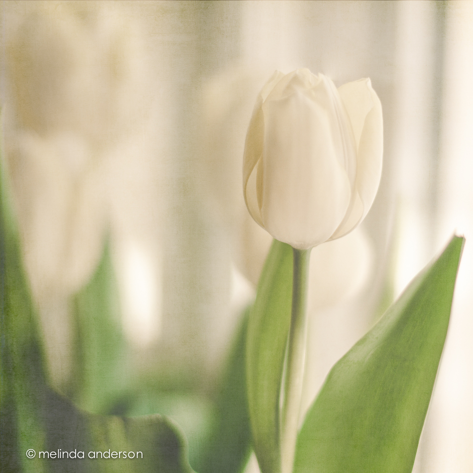
It is the end of the tulips, I’m afraid. I just have a few left- the purple ones. This shot is backlit- I love how you can see the light through the leaves. This image is textured with two layers of Kim Klassen’s 3003 texture.

For more images edited with Kim Klassen’s textures, head on over to Kim’s site.
I told you the tulips would be back- and I haven’t even posted any of the purple ones yet! This image is for Texture Tuesday- textured with Kim’s Sybil texture again.
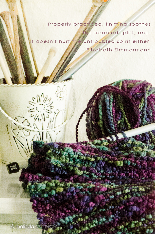
I have been on a decluttering spree. You could have filmed an episode of Hoarders in a couple of my closets- but no more! One of my missions was to organize my yarn. Photography has replaced knitting as my obsession, but I still love knitting and am not ready to give up my precious yarn (which is now mostly boxed up in labeled storage containers, thank you very much!). I had not knitted since my carpal tunnel surgery, so, when I found a half done scarf, I got inspired and am slowly finishing it. And, of course, knitting is a great subject for photography!
The challenge for this week’s Texture Tuesday was to use words in the image. The below is actually my favorite knitting quote- by my favorite knitter- Stephanie Pearl McPhee (aka the Yarn Harlot)- but it was a bit too long for the photo:
“In the nineteeth century, knitting was prescribed to women as a cure for nervousness and hysteria. Many new knitters find this sort of hard to believe because, until you get good at it, knitting seems to cause those ailments.”
Hahaha! You have to be a knitter to really get the truth of this! But, now that I think of it, you could substitute the word photographer for knitter and photography for knitting– and we could all relate!
I came across this quote from Elizabeth Zimmermann, the mother of modern knitting, which I think speaks to the meditative quality of knitting.
I spent WAY too much time on this photo edit: FOUR different Kim Klassen textures to get the tones I wanted (havana, sybil, reentry, and 0303), a hue/sat layer, a levels layer, a blur layer- HOLY COW! I know there was an easier way. . .
Yes, more flowers! Here’s that Trader Joe’s bouquet again. I got so many good shots from this bouquet- I just have to share!


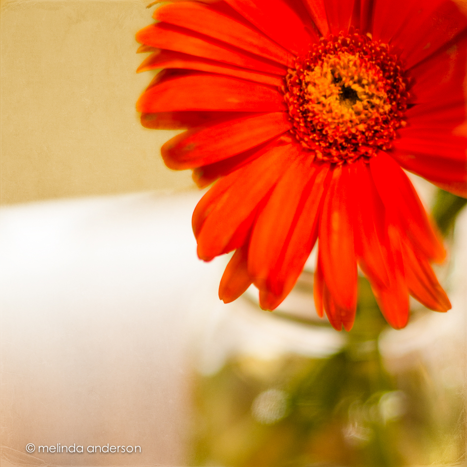
For this week’s Beyond Beyond assignment, we were challenged to take a series of photos with a shallow depth of field, focusing on different parts of the scene. We were then to choose our favorites to post. I chose my gerbera daisies, which are fading fast, for this assignment. Invariably, my favorites had the pink flower in front in focus, although I took quite a few focusing on the rear flowers or teapot. So here are the three I like best.

I took these three shots using the light from my bedroom window. If you look closely at the bottom photo, you can see a reflection of me sitting on the bed!
It’s Texture Tuesday- and the challenge was to create an image with a POP of color. Not thinking outside the box, I headed to the store to buy some gerbera daisies, my go-to flower subjects and favorite cut flower. And I used my go-to texture, Kim Klassen’s bent edges, which I desaturated and mostly brushed off the flower itself.
My second assignment for Beyond Beyond (aka 2B), was to practice using various apertures and look at the resulting depth of field- and then to have fun using editing techniques in Lightroom and Photoshop. The suggestion was to use Kim’s image of a white bowl of pinecones on a white chair, giving it a different look in processing. Well- I have pinecones and a white bowl and a white chair- so I took my own photos.
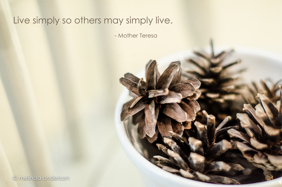
I used one layer of Kim’s texture, simplistic, at 65% opacity and desaturated the image slightly to get rid of my yellow walls. I googled simply to find an appropriate quote and found this one attributed to Mother Teresa. After editing, I discovered Kim had used the same quote (except for one word) attributed to some one else. Oh well- you can’t trust the internet!
