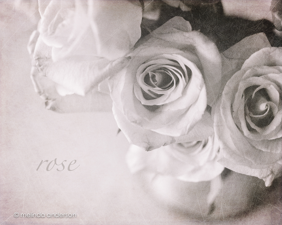
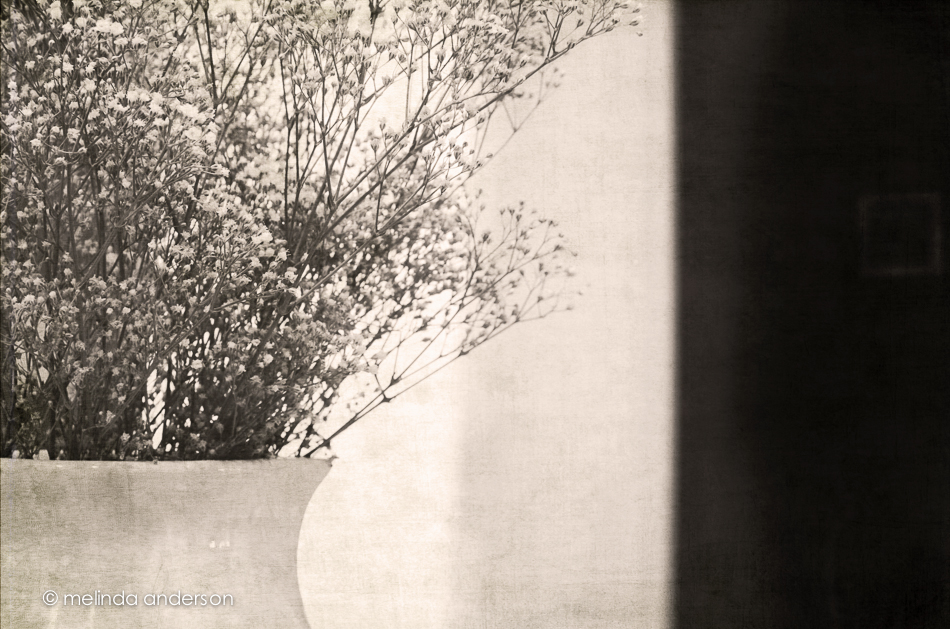
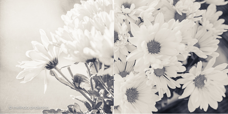
This might be the last view of these beauties. In Lightroom, I did a black and white conversion (to go with the black and white theme for this week’s Texture Tuesday), and some split toning to add a hint of pink. In Photoshop, I applied three textures at very low opacity (jacob, lovely lavender, and patina) and called it done.
Yellow Tulip
I haven’t totally abandoned old books as props; here’s a “basic reader” from 1931 with a tulip from my Mother’s Day bouquet (thank you, Matt!) as bookmark. As a former first grade teacher, I have a small collection of old primers and readers that I bought at garage sales or somehow acquired over the years. The theme for this week’s Texture Tuesday is yellow, so I added the yellow tulip. This image is textured with teatime by Kim Klassen. I’m also including another shot in black and white.
Morning Tea
The sun streaming in the window this morning made it easy for me to decide where to set up my shot today. I actually photographed my Texture Tuesday photo on Texture Tuesday- just like I did in the years I was doing my Project 365, when the photo posted each day had to be taken on that day. No such self-imposed pressure now, but I just somehow never got to it until this morning. This was one of my grandmother’ teacups and one of my mother’s old books. The key is one I borrowed from my friend, Debbie. The textures are Auineau, anna, and celebrate. Have a great day!
Still and more still
Create
Perfectly Imperfect
A few years ago I attended a knitting workshop. I was knitting along and noticed I had made a tiny mistake quite a way back in my project. Upon noticing my dismay, the instructor launched into a speech saying that it is the tiny imperfections that show the difference between handmade and machine-made. Handmade is made by a real person with skill and care; machine-made means, well, made by a machine! I’ve always thought of that when I look at the hand-painted designs on the pieces in my Blue Ridge pottery collection. Each plate, cup, saucer, bowl etc. was painted by hand, making no two pieces alike, even those with the same pattern. Perfectly imperfect (which just happens to be the theme for this week’s Texture Tuesday) !
Although I have almost an 8 piece set of one pattern, Sun Bouquet, I usually mix up my table settings and include pieces from several patterns. Most of the patterns I look for are in primary colors, so they blend well together. And there’s my newest Mason jar (yes, I now have two) in the middle- it’s perfectly imperfect as well!
Edited with two of Kim’s textures, 1301 and sybil. Linking up with Texture Tuesday today.
For Love of the Sun
I knew that today’s post would have at least one photo from my field trip to the Desert Botanical Garden. “For the love of . . . ” is the topic for this week’s Texture Tuesday, and, when I looked through my images, Sheryl Crow’s Soak Up the Sun started going through my head. Think of it as the soundtrack for these two photos!
These cacti must have been at least 15 feet tall. I used a small aperture, intending to get a starburst effect- but this is what happened. And I think I like it better this way!
This bird was perched at the top of one of the cacti. And how about the sun in this photo? Did I add it in post-processing? No- it’s actually flare from the sun on my right. Usually I clone those out. . .
Both photos have layers of an altered version of Kim’s ruemarion texture as well as kkcanvasback. The bottom one also has some magic textures in there.
Going Up
Quiet
Today’s Texture Tuesday theme is QUIET.
Hmmmm…… there hasn’t been much quiet around here lately due to the presence of two rambunctious little boys- UNLESS they are asleep. I took some photos of Henry asleep in the car and used a much more heavy hand than usual when adding textures. I used two layers of Kim’s 1612 at multiply mode (brushed off face) and then added a grunge texture from my Photoshop Artistry class.
Linking up with Texture Tuesday.
From Above
Yup- more of those same flowers!
It’s Texture Tuesday, so here’s a collection of photos I took last week of my baby’s breath bouquet (which is still going strong). I used Kim Klassen’s anna texture to edit each image.
I am so attracted to out of focus and ICM (intentional camera movement) images; I’ve done quite a bit, but haven’t put many on the blog. So- just for fun- I took this deliberately out of focus shot of the same bouquet, applied one of the artistic filters in Photoshop, and added a grunged up version of Kim’s dollard texture.
Still
LIGHT!
When I first started this whole photography thing, I literally couldn’t see the light. I think it took me almost a year before I was able to really see how light differs from moment to moment, from place to place. And now I am obsessed with it.
While we were in California, I took advantage of the beautiful light (and Spring flowers) when taking photos. The theme for this week’s Texture Tuesday is light, and I think this photo demonstrates how light (in this case, backlighting) can enhance a photograph.
Textured with bent edges and florence, by Kim Klassen.
All you need is . . .
More Squares
I am continuing my obsession with square crops with this flower diptych. I edited both of the photos in this layout in Lightroom, then added one of Kim Klassen’s textures, bamboo, in Photoshop. Then- it was back into Lightroom for an easy diptych layout.
Then, because I LOVE black and white, I duplicated the diptych and did and did a b&w conversion. I like this version even better.


