Once a teacher. . .

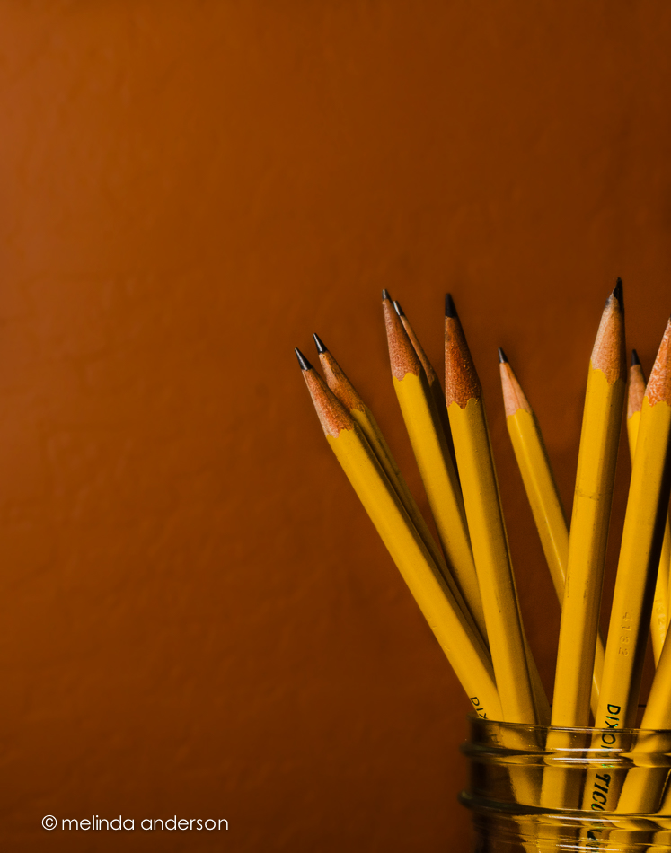
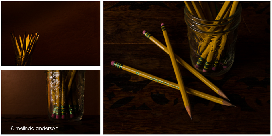
Yesterday I photographed No. 2 pencils.  I’ve photographed pencils before, but I had this image in my head that wouldn’t go away: bright yellow pencils with my orangey wall as backdrop. I even made an early morning (well, 8:00- early for this retired person. . .) trip to the grocery store to buy brand new pencils.

20140910-DSC_3956_melinda_anderson-EditI think I’ve already written of my lifelong love affair with office supplies, something I inherited from my grandma, Mimi, who would drive my mother crazy in her later years by asking to be driven to the stationery store (this was way before Office Max was born) because she needed a new pen. We would stand around and watch as she carefully tried out each pen before deciding on the right one.  She wrote with fountain pens, sometimes the cartridge kind, but usually a beautiful Parker fountain pen with turquoise ink.

When I was a little girl, I loved the beginning of the school year and the passing out of brand new school supplies.  We even got modeling clay to keep in out desks; I distinctly remember the smell! When I started teaching, I loved the boxes of new supplies I would unpack each year and pass out to my students.

So today, I am thinking about school supplies.  And brand new sharp pencils.

Pencils: dark side

pencil_triptych

Pencils: bright sidepencil_diptych

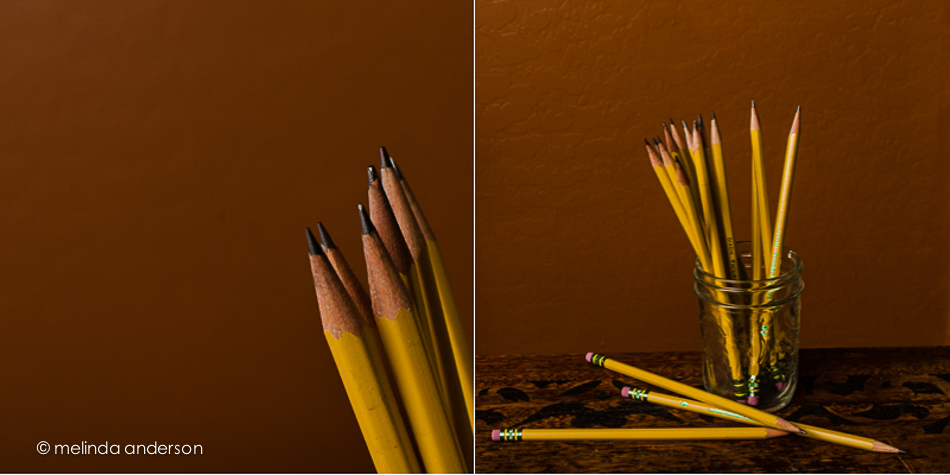
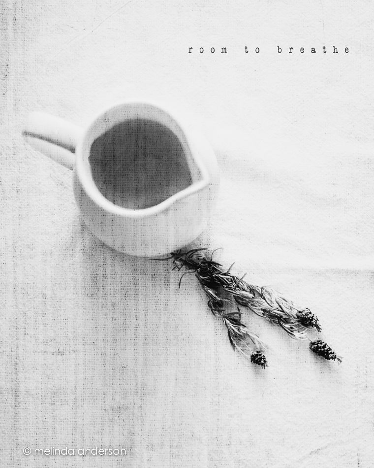
After I took these photos, I saw that a new assignment had been posted in BeStill 52- a still life portrait.  This could be a self-portrait, I suppose.


Books and a Cup

It was a stormy monsoon of a day- a good day to practice my still-life skills.  I’d been feeling the urge to photograph old books again, so went to the bookshelves and pulled down four of my mother’s books (which I treasure) and my childhood thesaurus (the torn and tattered one).  I added my cup of coffee to the scene and went to work.  Afterward, I edited them with a matte curve in most and adjustments in white balance and/or split-toning to get the tones I was trying to create in the image.

books_and_cup_diptych books_and_cup1I took two of the images (the first and fourth) into Photoshop and added textures- Kim Klassen’s yesteryear and sweettart.

Linking up with Texture Tuesday today.

Still Life in the Morning

The other morning, I was reading the paper and drinking coffee, when I noticed that the coffee cup and newspaper made a pleasing composition.  I started to pick up my iPhone, but then thought- Hmmm, if I pull the plant over a bit and get some strawberries it will look even better.  I quickly made an arrangement, snapped ONE photo, edited it in Snapseed, uploaded it to instagram, and then continued to drink my coffee and read the newspaper (and ate the strawberries . . .). If only I could have still life composition ideas come to me that easily all the time!

I was about halfway through my coffee, when I thought of getting out my Nikon and taking the photo again.  After all, one of the BeStill 52 prompts was cuppa.  I got out more strawberries and tried to duplicate my iPhone photo- trickier than it sounds, considering focal length, depth of field etc.

So here are some Sunday morning stills, quickly taken.  All have two layers of Kim’s grunge texture added.


20140831-DSC_3736_melinda_anderson-Edit20140831-DSC_3754_melinda_anderson-Edit20140831-DSC_3748_melinda_anderson-Edit

And here is the original iPhone photo.

Photo Aug 31, 9 08 00 AMLinking up today with Texture Tuesday.

Unstaged

One of the recent lessons in BeStill 52 was to create an unstaged (or at least a seemingly unstaged) still life.  I’ve been busy- or at least preoccupied- but finally made some time earlier this week to get it DONE.

Of course, the first step was to get caffeinated, and, as the coffee started coming out of the Keurig, I grabbed my camera and took a few unstaged shots.  Encouraged by how easy this was, I added a nectarine and a knife and finished the shoot in less than 10 minutes.  If I had known how fast I could get it finished, I would have done it sooner!

Inspired by my photo friend, Barbara, I edited each photo with a different preset and am calling it DONE!

messy_layoutPresets used (all by Kim Klassen):

Left- truegrit

Right- oldendays and lettherebelight (one of my all-time favorites)

Preset Power

It is amazing to me how powerful Lightroom is for creative edits.  I would expect it to be great for straightforward exposure, clarity, cropping etc. when editing a photo- for a “clean” edit.  However, there is so much potential in this program for creative edits as well- for things you would expect to have to go into Photoshop to do.  And presets make it soooooo easy!

In this Week 8’s lesson in BeStill 52, Kim Klassen provided us with two presets (hazy dazy and breathe) to try on our images. The topic of the lesson was backlighting, which was challenging with yesterday morning’s overcast skies. Although the roses (it was our 43rd anniversary yesterday!) were set on the covered porch and were backlit, it is hard to tell in this closeup. I have other photos I’ll post soon.

Below are four versions of the same photo. Which do you like best?

PRESET_POWER_LAYOUTRow 1

Box 1- “clean” edit

Box 2- darkday preset

Row 2

Box 1- hazy dazy preset

Box 2- breathe preset


Shells and more shells

I am lucky enough to have a couple bags of shells my father brought back from the South Pacific after World War II- from the island of Eniwetok, to be exact.  Alhtough I’ve used some of them in other photos, I got them out again yesterday to shoot with my macro lens.

I wanted the shells to be on a wood background, but I don’t like how the grain of my dining table looks in photos- and, truthfully, I didn’t want to lie on the floor.  I haven’t bought any kind of tray for still life (still plan to) or wood to use as a background, but I came up with something that for me was a brilliant solution, if I do say so myself!  I took the little drawer out from the dental cabinet where my treasures are housed, turned it over, and scattered the shells on top.  The wood you see in the photos below is birds-eye maple, which is used for the inside of the drawers in the otherwise mahogany cabinet. I used side lighting from the sliding glass door- and a wide aperture with my macro lens to create shallow depth of field (BeStill 52 lessons).

20140707-DSC_0747_melinda_anderson-Edit 20140707-DSC_0736_melinda_anderson-Edit 20140707-DSC_0738_melinda_anderson-Edit 20140707-DSC_0743_melinda_anderson-Edit

All the images are textured with two layers of Kim Klassen’s simple or simple1 textures.

Linking up with Texture Tuesday today.

One Year Ago Today

One year ago today we had our first look at the house that would become our Arizona home!

20140702-DSC_0656_melinda_anderson-Edit

July 3, 2013 found us looking for a house to buy in Arizona after having bravely sold our California home without knowing for sure where we were going.  We were pretty sure Prescott was the place- we had good friends here, we were were looking for a small town and a simpler lifestyle- but we needed to find the right house! Our realtor wasn’t much help, but our friend Debbie found a house just listed online that seemed to fulfill our requirements (one story, 4 bedrooms, open floor plan, easy maintenance). We got the realtor to get us in- and the rest is history! I knew it was the place when we walked in the door- it just felt like home. We ended up making an offer, but lost out to another buyer. Dejected, we drove back to California without having bought a house and talked about renting until we found the right one.  A few weeks later, the other buyer’s deal fell through, and we got in the car to drive back to Arizona to visit the house again and make an offer. On August 24, we moved in!

Back in California, I spotted this table runner at Pier 1 and bought it for our Arizona home.  I love the Southwest colors and how it looks it with my Trader Joe’s sunflower bouquet.

20140702-DSC_0638_melinda_anderson-Edit

I took these shots for Be Still 52, Week 7, a lesson on depth of field and a softly focused background.


Still Life Play

I am continuing to play with still life, but not going too far outside my comfort zone for this photo session (maybe NEXT time. . .).  In fact you’ll notice these images are all VERY similar. Feather and book, book and feather.  The last two have an added hat, and the book was changed from The Red Badge of Courage to The Secret Garden (and I moved outside).  I think my favorite is the second one (I like the blue book).

20140627-DSC_0483_melinda_anderson-Edit 20140627-DSC_0482_melinda_anderson 20140630-DSC_0627_melinda_anderson 20140630-DSC_0634_melinda_anderson-EditEditing notes:

1. converted to black and white in Lightroom, kk_celebrate texture added in Photoshop

2. edited with Kim’s moody preset in Lightroom, highly tweaked

3. edited with Kim’s days of old preset in Lightroom, and tweaked

4. basic edit in Lightroom, Kim’s kk_happyheart texture added in Photoshop (2 layers)

Dark and darker

22May2014-8243-Edit

Edited in Lightroom with Kim Klassen’s dark mood preset (adjusted)

Texture added: Kim Klassen’s july, desaturated

I created an even darker version by desaturating the Photoshop version in Lightroom and adding some split toning.

22May2014-8243-Edit-2

Linking up with Texture Tuesday

Vertical

I seldom used portrait orientation when taking photos until a couple of months ago.  Now I seem to be doing it regularly! I may have started turning my camera in my bathroom “studio” to avoid getting towels and bathroom fixtures in the shot, but then I continue to use it- especially when I want a shallow depth of field in front of, as well as behind, my subject.  My 50mm lens does this beautifully, as well as my 85mm macro lens.  I would love to own a LensBaby some day to play with moving the focus around! I did order one for my iPhone (coming in August through the kickstarter deal), which will partially satisfy my desire for this cool lens.

Here are two shots with a vertical (portrait) orientation. The first was taken with the macro lens.  I took the photo with both orientations, and liked the vertical one best (those blurry berries in the background and a small unfocused slice in the front).  There is some texture added to this image (a bluish one from Kim Klassen- teal?).

3June2014-9977-Edit

The one below was taken with my 50mm at 1.4 to give a very narrow field of focus- with lots of blur in the front. It was actually taken for a Be Still 52 lesson on side lighting.  The cup was placed on the floor by the open front door (on the left for light)- with a piece of white foam board for a background.  There is also a bit of lighting coming from the patio door farther away on the right.  I used my Warm Black and White preset (some split toning) for the black and white conversion.20140620-DSC_0201melinda_anderson


Room to Breathe

My latest still life assignments for Be Still 52 are below.  We were challenged to give the subject of our still life “room to breathe.”  The first image shows my usual style- off center, close up, shallow depth of field- and part of the subject not in the frame.  The second image adds some space surrounding the subject.  It was interesting to me how difficult it was to be this far away from what I was photographing- I kept wanting to step closer.  A good exercise!

10June2014-0079-Edit-2 10June2014-0088-EditBoth photos are textured with Kim Klassen’s waterfront 1.

Melancholy and iPhone Fun

Since I’ve been back, I’ve been catching up on life, and my photography work has consisted of culling and editing photos from Yellowstone and getting images edited and printed for my photography groups.  I was also 2 or 3 weeks behind in Start to Finish and Be Still 52 (Kim Klassen’s classes), but knew I would have time to catch up soon.

A couple days ago I started going through the lessons I hadn’t done and found myself feeling inspired again to create a still life. One of the more recent lessons included a preset called melancholy– and a suggestion to revisit the whole wabi-sabi idea, which I loved. I enjoyed creating this image, which is very different from my usual shooting and processing style.

10June2014-0081-Edit

And now for a couple random iPhone photos. I didn’t take many photos this week, but did enjoy processing them.

This is the bridge (over a dry wash) that we cross when we walk the trail at Willow Lake. If you look closely, you can see the white southwestern prickly poppies that are in bloom along the trail.  The basic edit was in Snapseed- and then I used one of the filters in Glaze (an app that I really don’t understand) and added some textures in Mextures, which also gave it a vignette.

Photo Jun 10- 11 23 03 AM

The photo below was taken in our front yard and is a closeup of the flowers (and fruit?) of a spiky foundation planting in our flower bed.  Now that it’s blooming, I notice this plant everywhere we go in Arizona. Last fall I cut off many of the dried stalks and put them in my old milk can on the front porch. You can see what they look like dried here. I edited the photo in Photo Wizard, which is a great app for basic editing (it even has a curves adjustment!), as well as having a zillion special filters and effects, from textures and vignettes to motion blur and a bathroom glass filter.  I have yet to explore it fully- guess I need to go on another road trip!

Photo Jun 10- 11 42 09 AM

I’m linking up with App-happy Wednesday again!

Keeping With The Times